Branding
Color
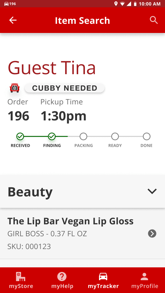
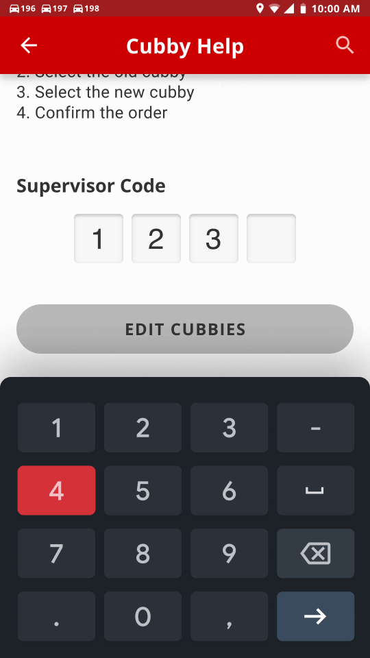
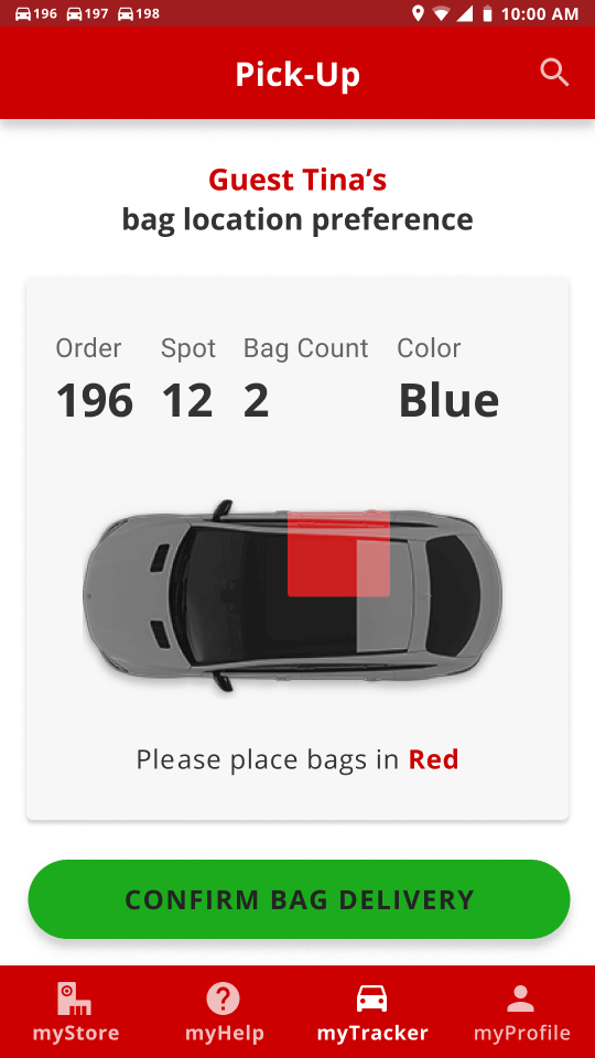
We utilized the official Target Red as the primary color to make the prototype feel more real. The white and
off-white that Target uses as backgrounds was used as backgrounds in the prototype as well, but on top of
that it was repurposed for neutral “empty” states for elements such as chips and cubbies. We also use two
different greens in a different way that Target uses them. We use the brighter and more saturated green for
success or confirmation buttons, and the darker green for success states that are just to notify the
employees that something went well, such as snackbars and checkmarks. We repurposed the Target Clearance
yellow to be more informative. It’s used for the map’s route throughout the store, as well as a snackbar
state to tell the employee they have scanned the wrong item.
Typography
Through our research and looking through Target’s website, it seems they use a proprietary typeface called
Targetica — a modified version of Helvetica to suit Target’s needs. Since we could not get our hands on the
typeface, we used Open Sans — a Google Font that has similar qualities to Targetica, and if this app is
implemented into Target’s employees’ routines, then naturally we can assume that the typeface would be
switched out.
We decided to use Open Sans at a low contrasting type scale. It’s a purely utilitarian application. Having a
small type scale allows users to have more information to be present on the screen. For accessibility
purposes we set the minimum body size to be 18px. There are notable exceptions throughout the prototype with
smaller text sizes, such as captions and overline.
-
Section titles
-
Open Sans
-
18px
-
Button text
-
Open Sans
-
16px
-
Caption text
-
Open Sans
-
12px
Iconography
To keep with the Material Design System, we utilized Target’s iconography. In denoting the different forms of
delivery, (curbside/in-store/same day delivery/etc.), we used Target’s already existing icons to keep the
employees and customers on the same page.
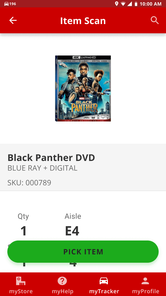
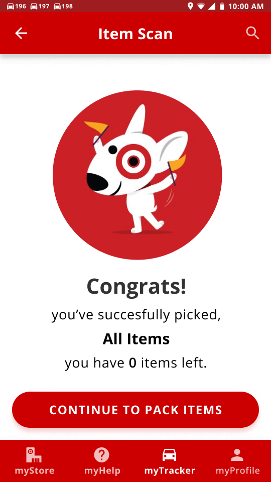
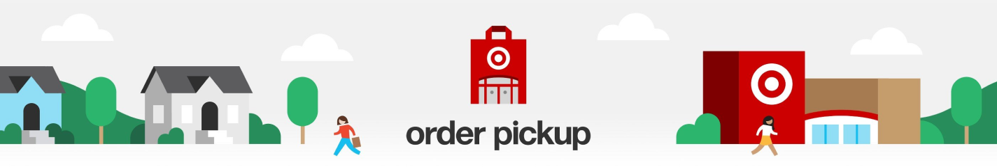
Imagery
We wanted to motivate the employees by making the application more delightful. To do this we decided to add
illustrations, but we also wanted to keep the iconic illustrative style that Target already uses on their
website, therefore we went through Target’s website and reused the illustrations.
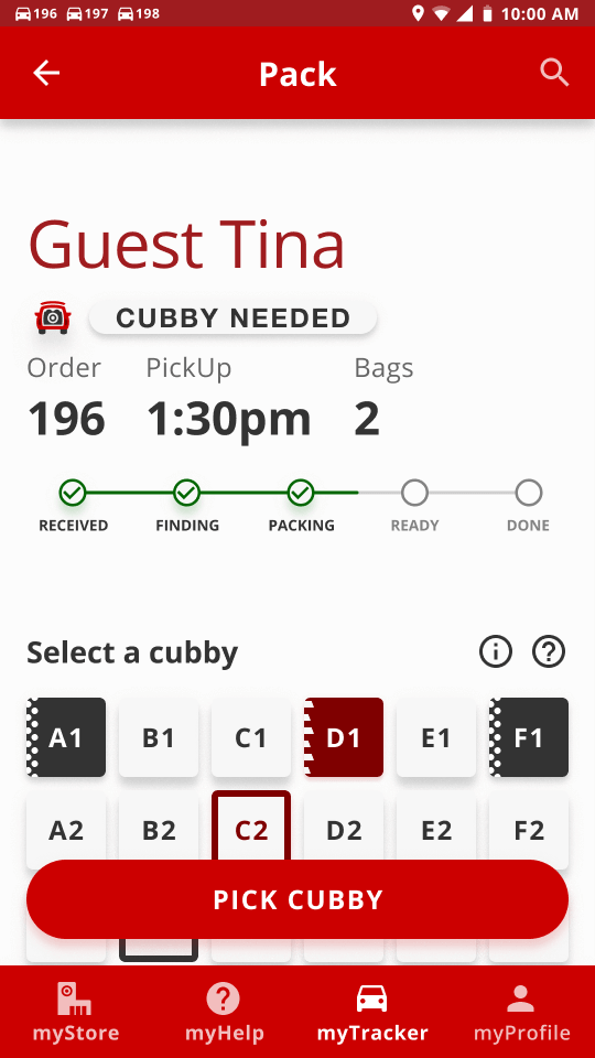
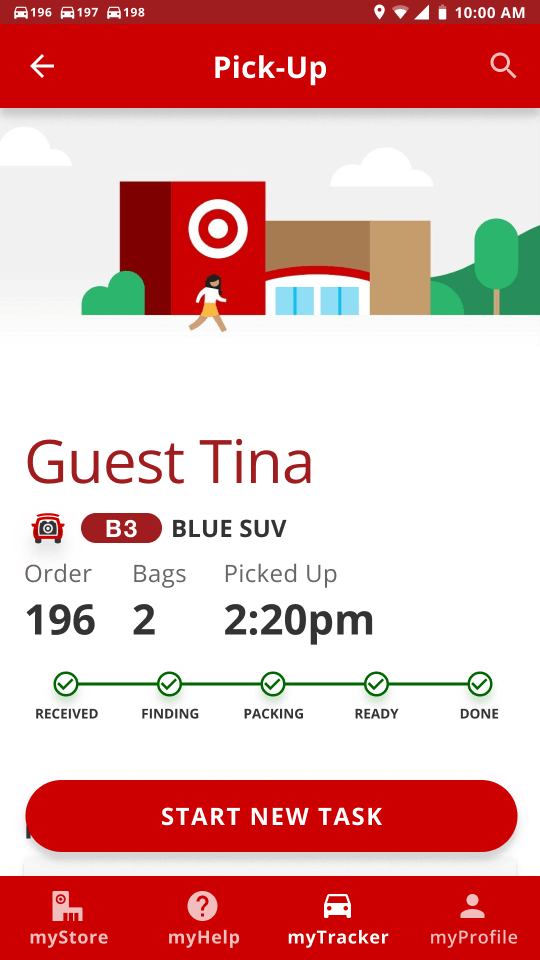
Elements
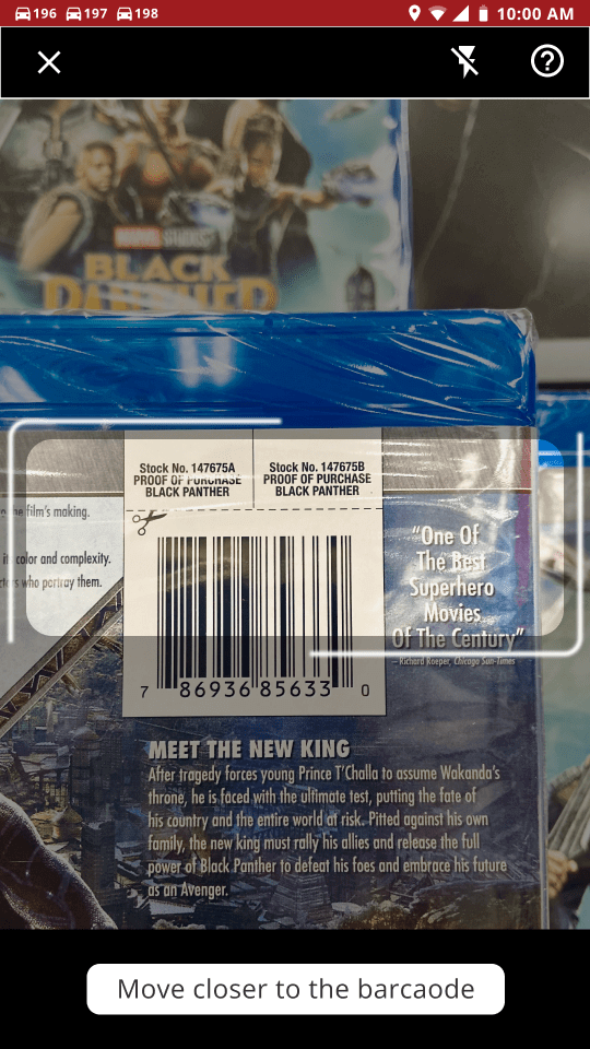
Everything began with the Material Design System as a base level of elements. We utilized Target’s
pre-existing top and bottom navigation bars, in addition to their radio buttons, and scanners. As with every
other project, we needed to create custom components. To add some friendliness to the prototype, most
elements have rounded corners (buttons, cubby selections, chips, etc.).


