Overview
I was given the proposal to create a tool to assist pharmaceutical representatives and customer facing
colleagues with their daily schedules and meetings with Healthcare Professionals (HCPs). Pfizer
representatives are always on the go from meeting to meeting informing HCPs of their company's products and
what they do. Because representatives spend a majority of their time in between meetings and sitting in
office waiting rooms, they need a portable assistant to help them plan their day.
How might we, as designers, keep Pharmaceutical Representatives on schedule and at the top of their
game?
Scope and Constraints
Representatives' days are hectic and they constantly find themselves in varying situations, so any tool in
their toolbox needs to be as adaptable as the representatives themselves. The current tool in circulation
has information buried within different sections of a one-stop-shop iPad application, often taking upwards
of five minutes for all of the data to load per request. Pharmaceutical reps are meant to be experts on the
brands they represent, and need to know the conditions their products treat. Taking five minutes of waiting
just to begin researching information to answer a question is an understandable source of frustration.
Process
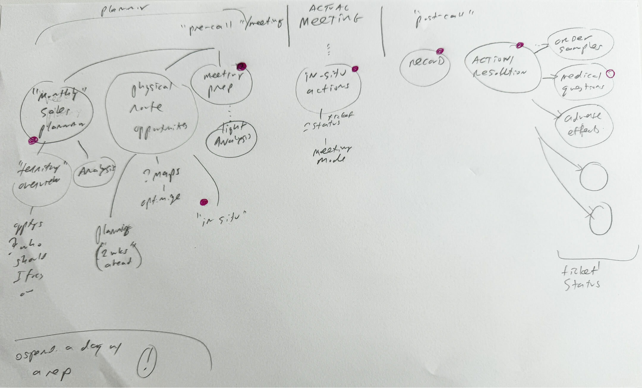
I co-hosted a workshop to ideate on potential concepts based on the more concrete requirements I had
received for pre-meeting, mid-meeting, and post-meeting tasks. We collectively worked on user flows, of
which I drew pencil sketches of screen ideas. In the middle of sketching, I remembered my mother’s
PalmPilot growing up and how it had almost all of the same product requirements:
-
A calendar
-
A daily planner
-
An address book
-
A GPS (which later palm devices included)
The final requirement was to center the app around answering HCP-related questions, as all projects
require a level of complexity to tailor the solution to its unique problem.
Migration Process
Due to representatives already using an existing tool, the workshop members worked together to create a plan
to slowly migrate more reps to the new tool with each passing year.

User Flow
Each daily routine a representative has can be broken down into three steps:
-
Pre-Meeting
The preliminary legwork: From taking a look at their schedule, to reading an analysis of
prescribers, to preparing for a meeting.
-
Meeting
The sit-down discussion with the Healthcare Professional.
-
Post-Meeting
Reps need to record the discussion and take action (Order samples, write followup email,
etc.)
Branding
Scout follows Pfizer’s branding through using Meraki Design System with a heavier focus on legibility as reps
would need to go through multiple paragraphs of research. For this reason, all body copy uses a larger
leading size. The standard Meraki leading size is 120%, whereas the Scout body copy leading size is 150%.
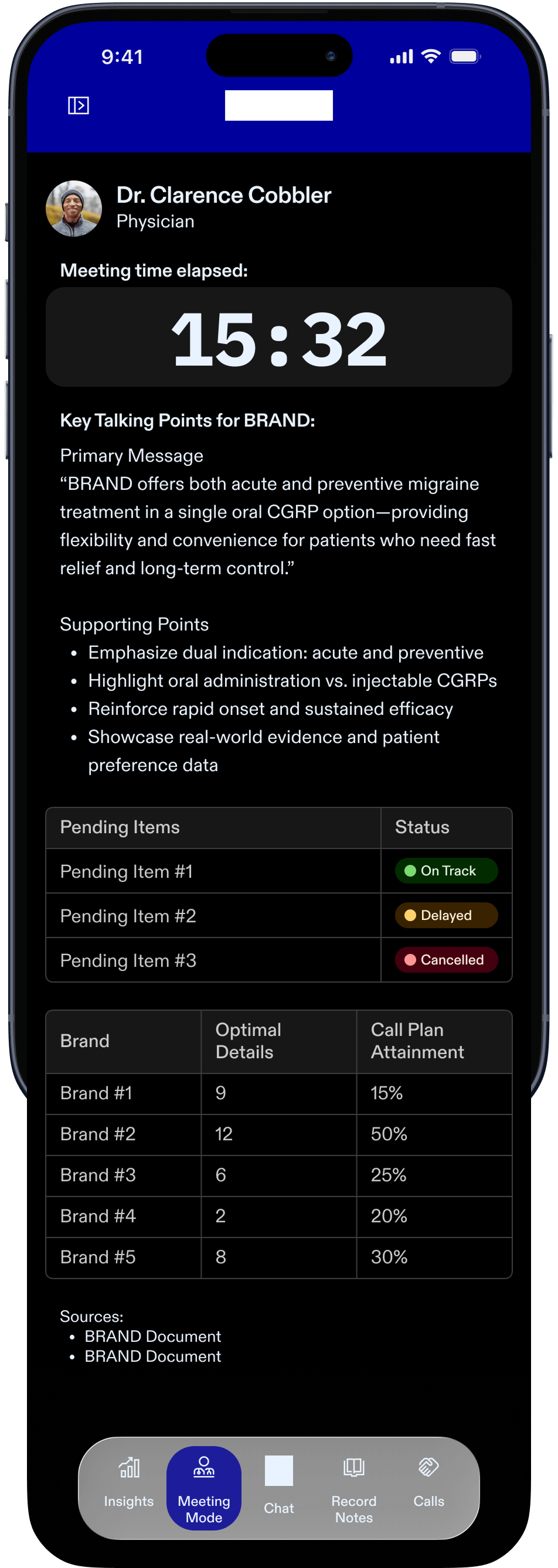
Certain screens are in dark mode for discretion, such as the Meeting Mode screen. The Meeting Mode Screen
allows the representative to look up information in front of the HCP without suddenly becoming disoriented
with a bright screen. Since iOS is placing a heavier requirement on Liquid Glass, I also introduced Liquid
Glass components, such as the Navigation.
Wireframing & Prototyping
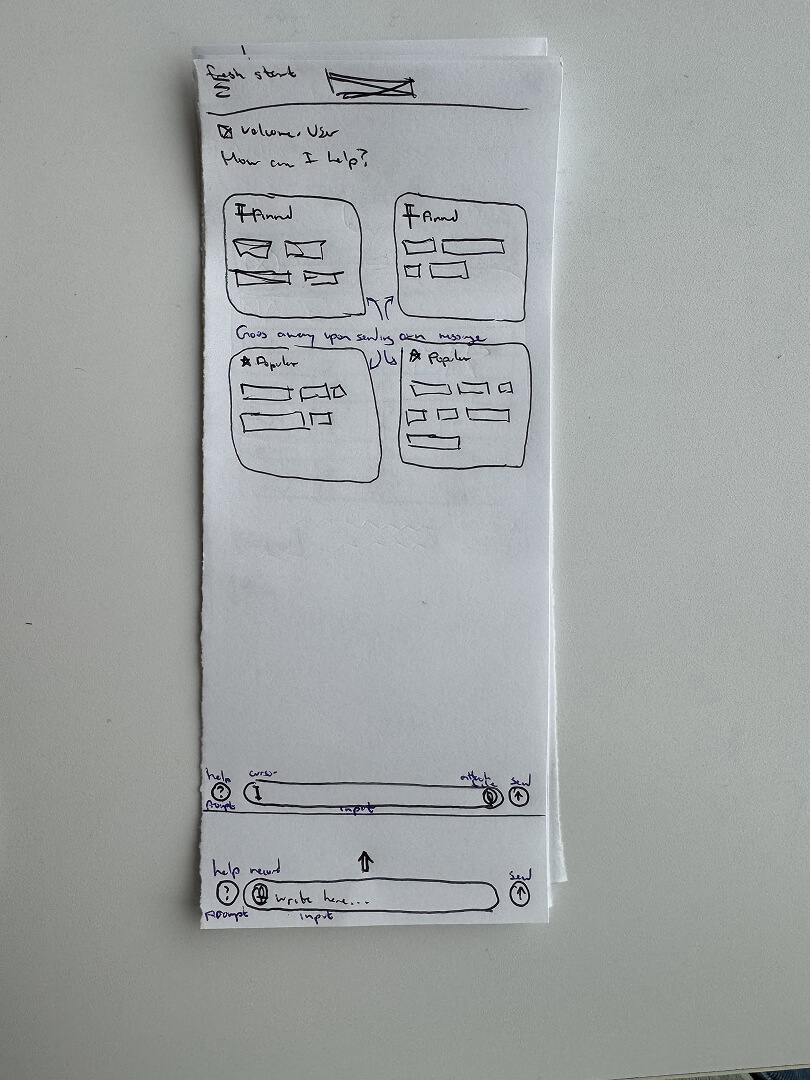
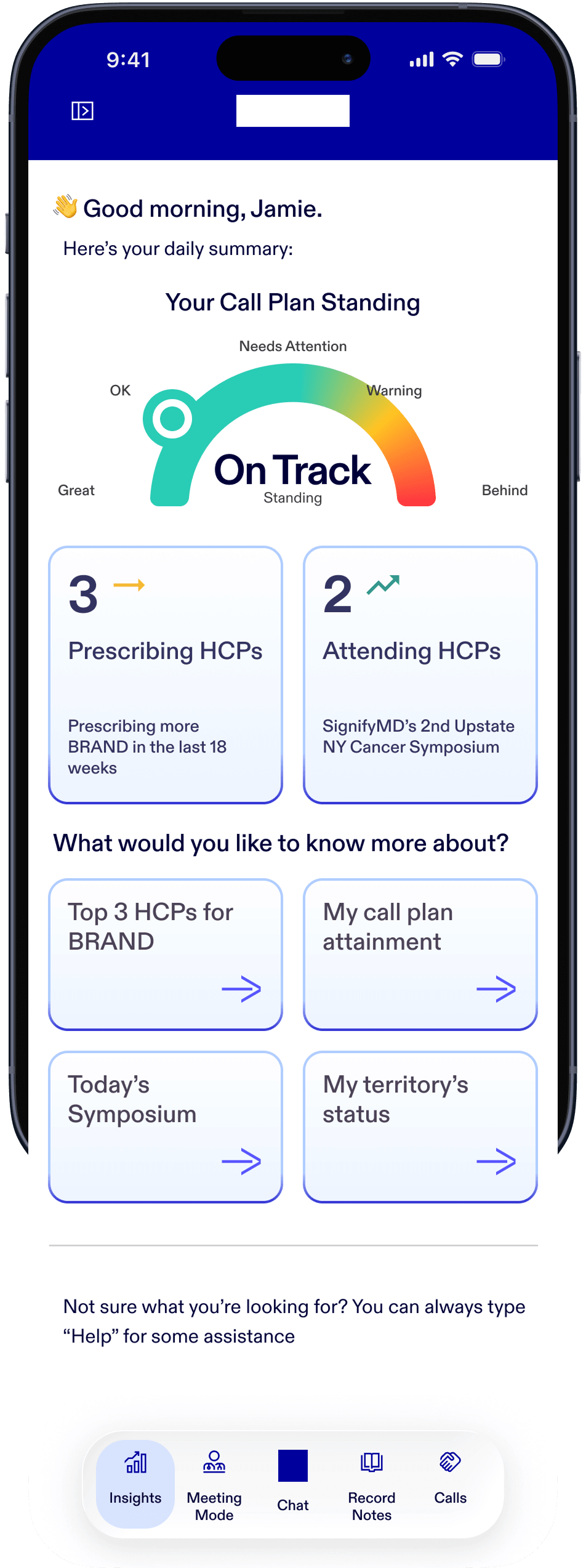
The core idea behind Scout is equal parts traditional app components and chat. I designed the homepage to
provide everything a rep needs to see at a glance, like how their Call Plan is going, or any changes that
may have been implemented since they last opened the app. Beneath the listed stats, Scout will suggest
topics based on the time of day and brands the rep is managing.
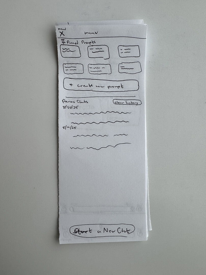
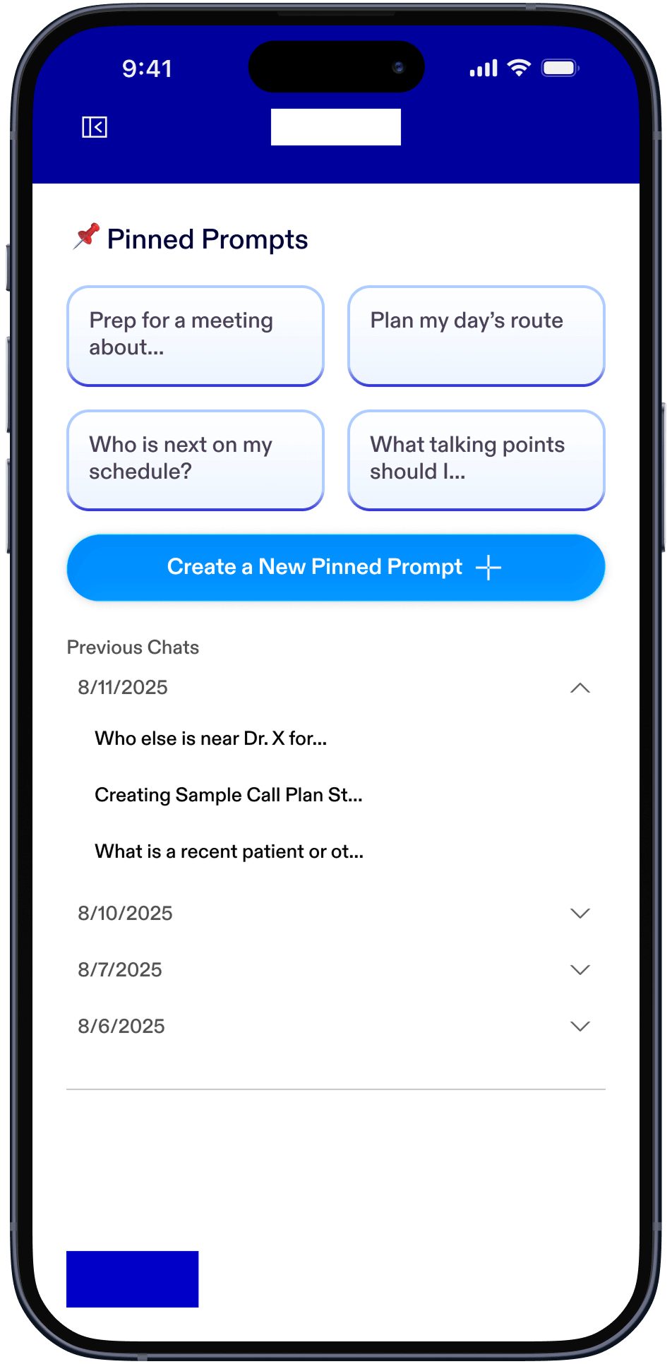
The menu contains user-pinned topics for various functions, including to start a new pre-populated chat, an
option to create a new pinned topic, view chat history from the last 14 days, and a clear chat history
button.
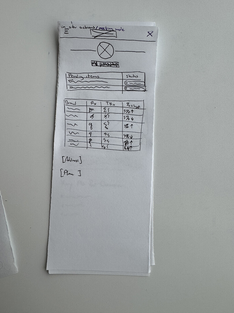
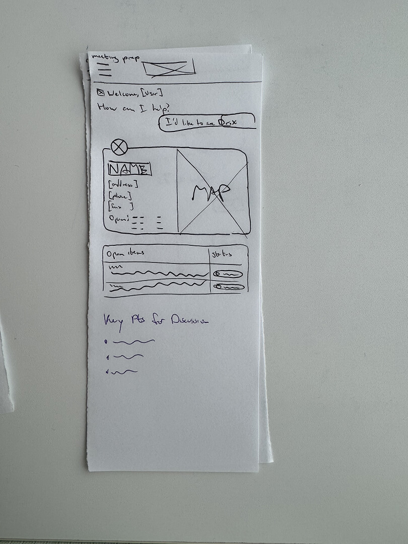
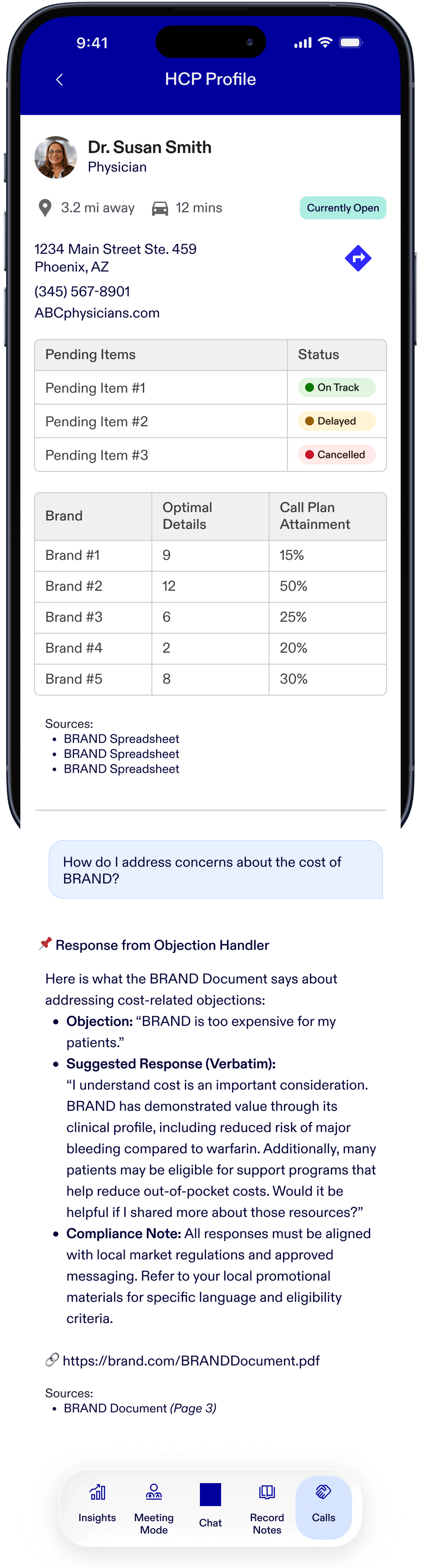
I created “Meeting Mode” for a Rep to be able to quickly glance at the Healthcare Professional's details
pertaining to the brands they may ask about, as well as sample orders they may ask about. I also included an
elapsed time for the Representative to discretely see; given that both Reps and HCPs have very rigid
schedules they must adhere to, a tool showing elapsed time of an interaction is essential.
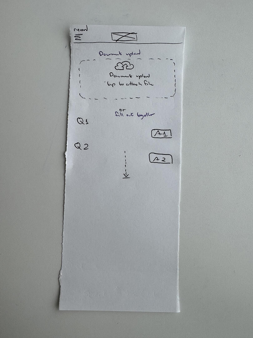
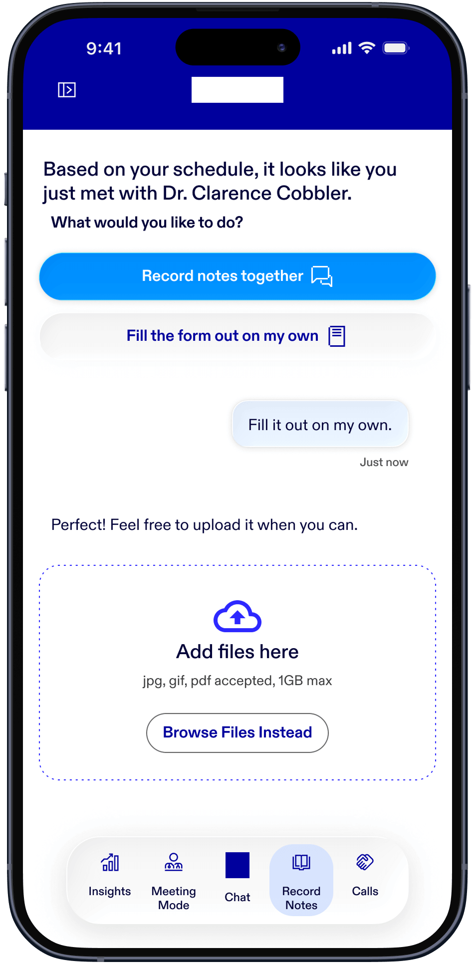
For the post-meeting, Representatives must document how the meeting went, any necessary follow-ups for
ordering samples, making sure deliveries are on time, and other notes needed to contextualize the
interaction and the relationship with the HCP. The following mockup allows the Reps to either fill the form
out on their own and upload it to Scout manually, or take a photo of the printed, completed form and upload
it that way. There is another option for users to record the form together with the app asking the form
questions and the user entering each input in a Q&A format.
The following HCP Profile screen is similar to the view in Meeting Mode, except it contains more details
about the HCP's office location and a button to set up directions to the office on a map.
Outcomes and Lessons
Because of the existing app, our suggestion of creating a new separate app was met with pushback because it
required a new set of security features. Due to Pfizer reprioritizing various initiatives, this project was
never fully realized, therefore no KPI’s could be accurately measured in the field.
My personal favorite part of Scout was how different the experience is in comparison to apps I have
previously used and worked on. The hybridization between traditional app components, like the navigation,
tables, and menu and the chat integration, made Scout a unique challenge and, I believe, an interesting
direction to which the industry could move towards.