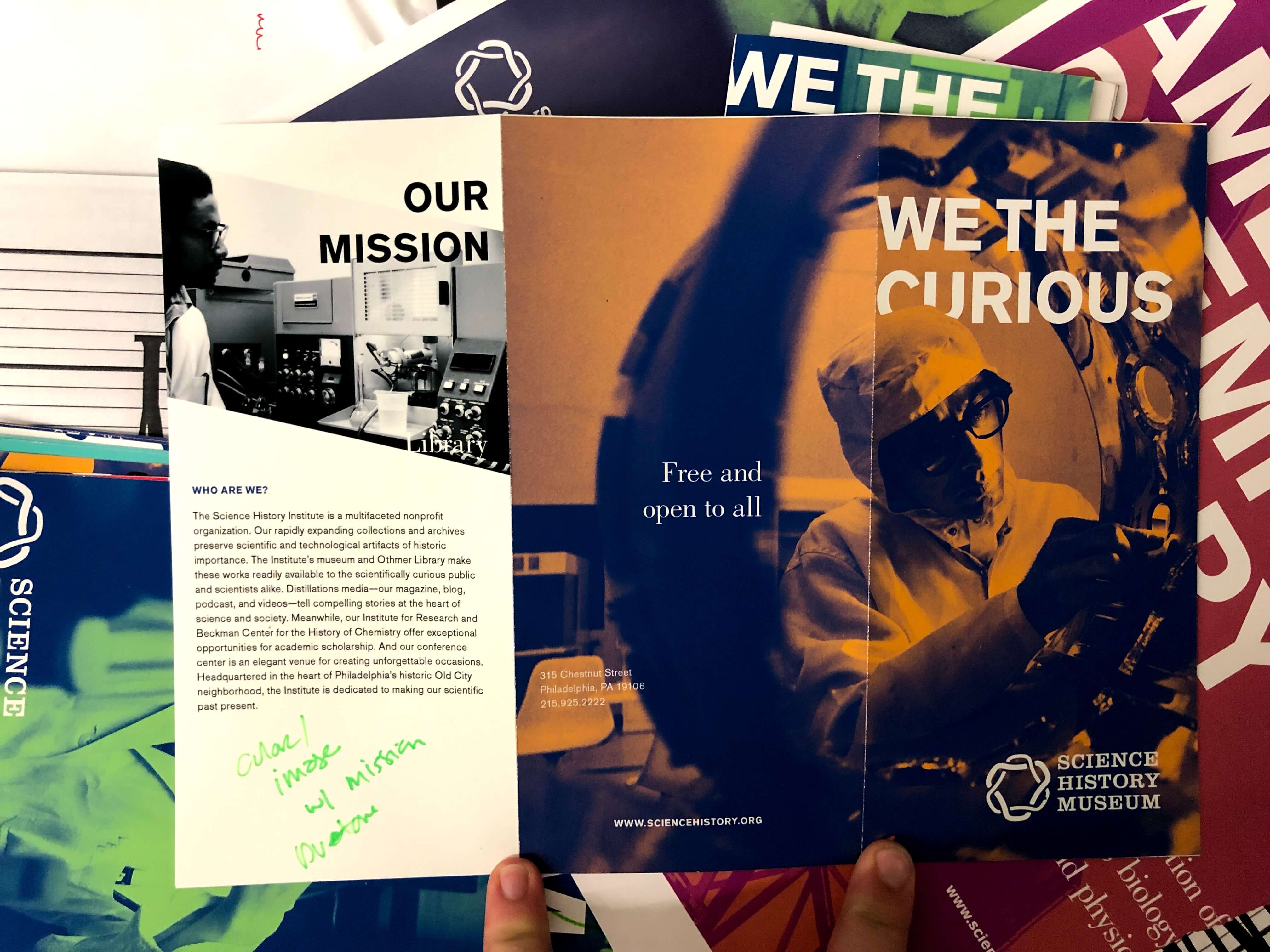
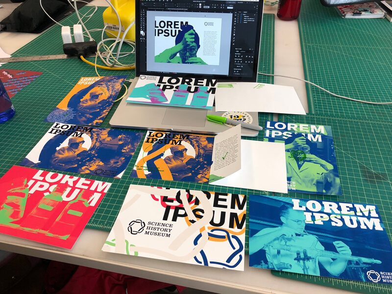
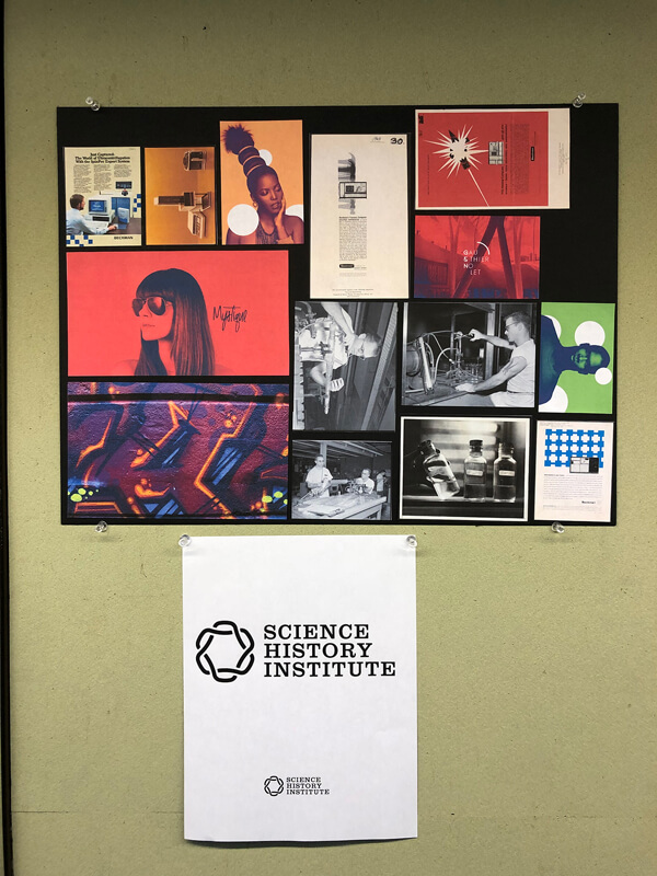
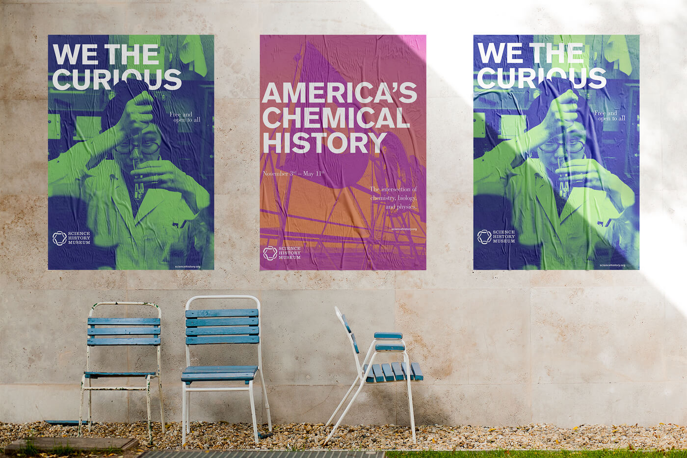
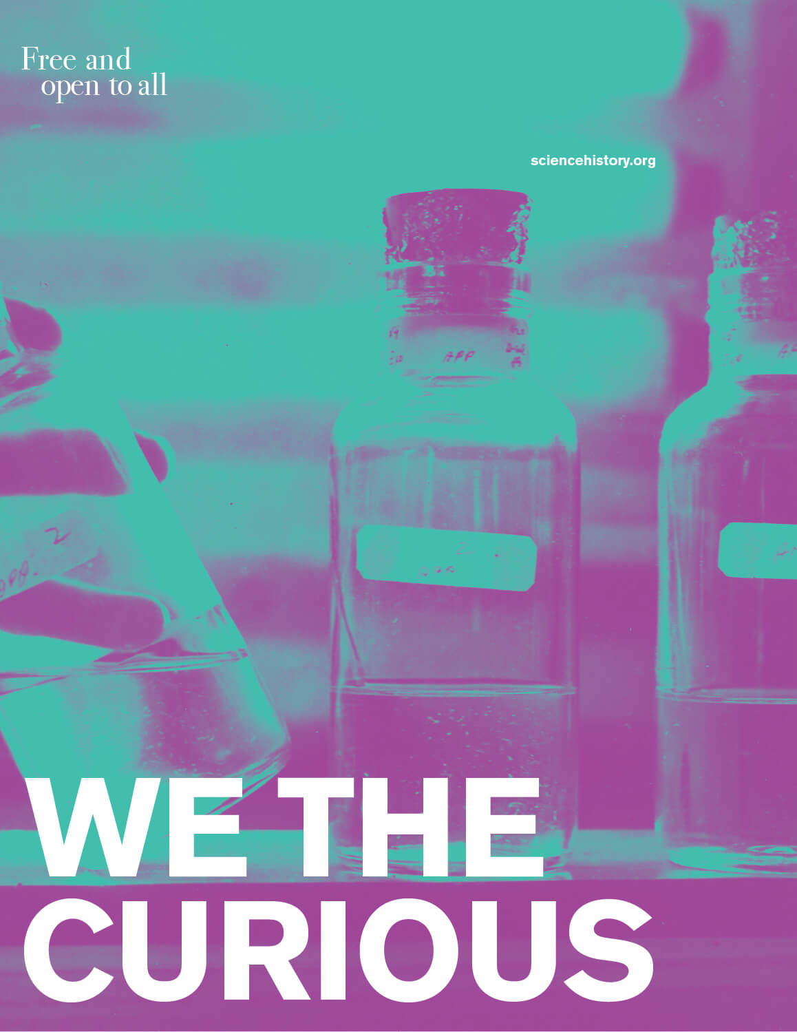
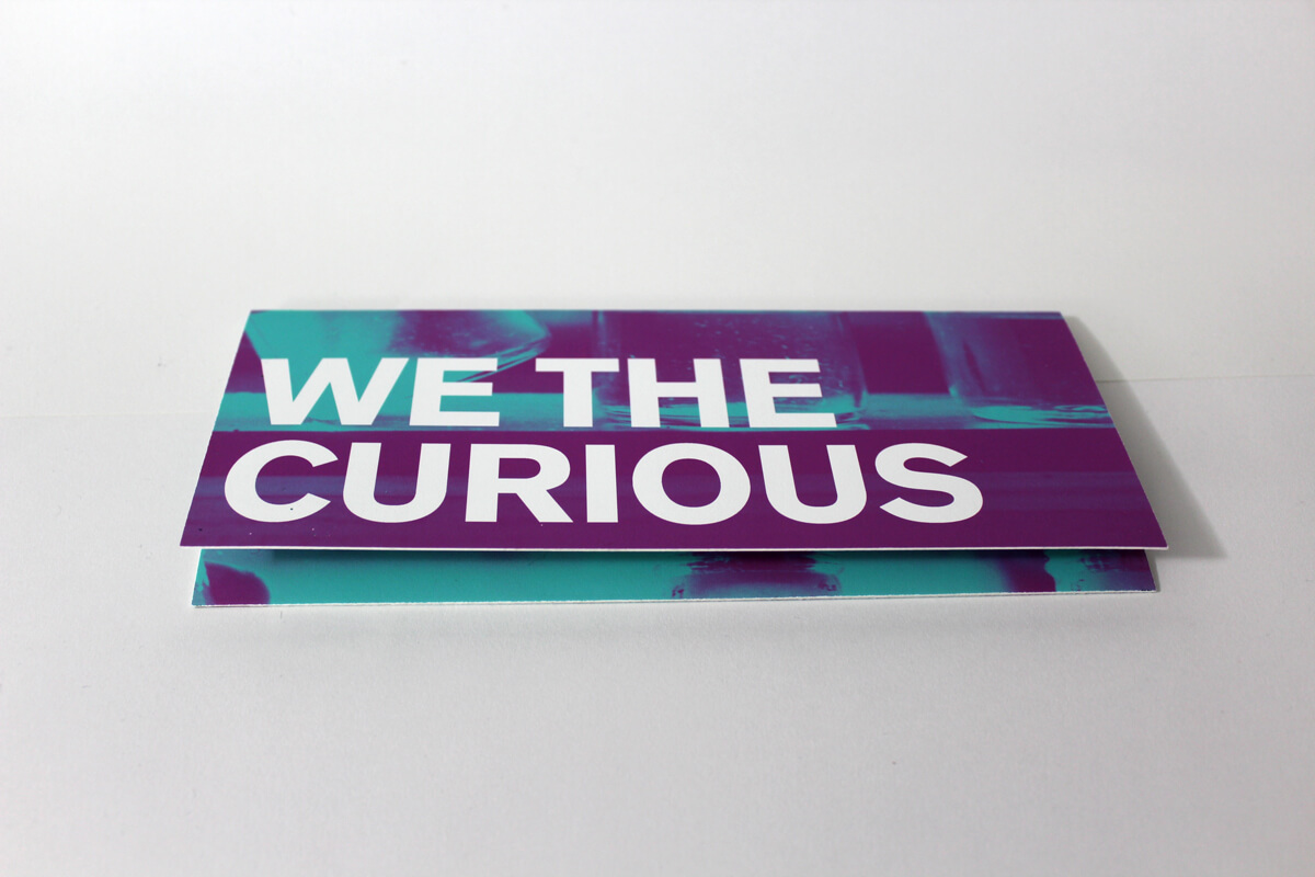
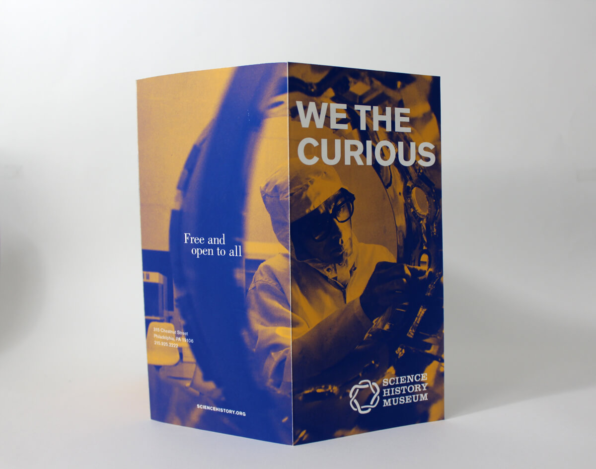
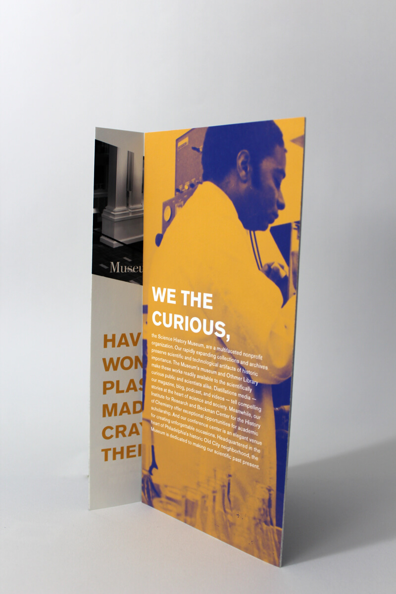
I set the museum’s brand apart from others in the area through the use of duotone imagery, headline text that weaves in and out of the photographs and the places in which advertisements appeared. I was inspired by their rich archive of
science related imagery and graphics, as well as duotone imagery with layered text. Their archives include diagrams, advertisements, photographs, and portraits dating all the way back to the 1440's. Looking through their archive, I
realized how underutilized it was throughout the museum and their brochures and magazines.
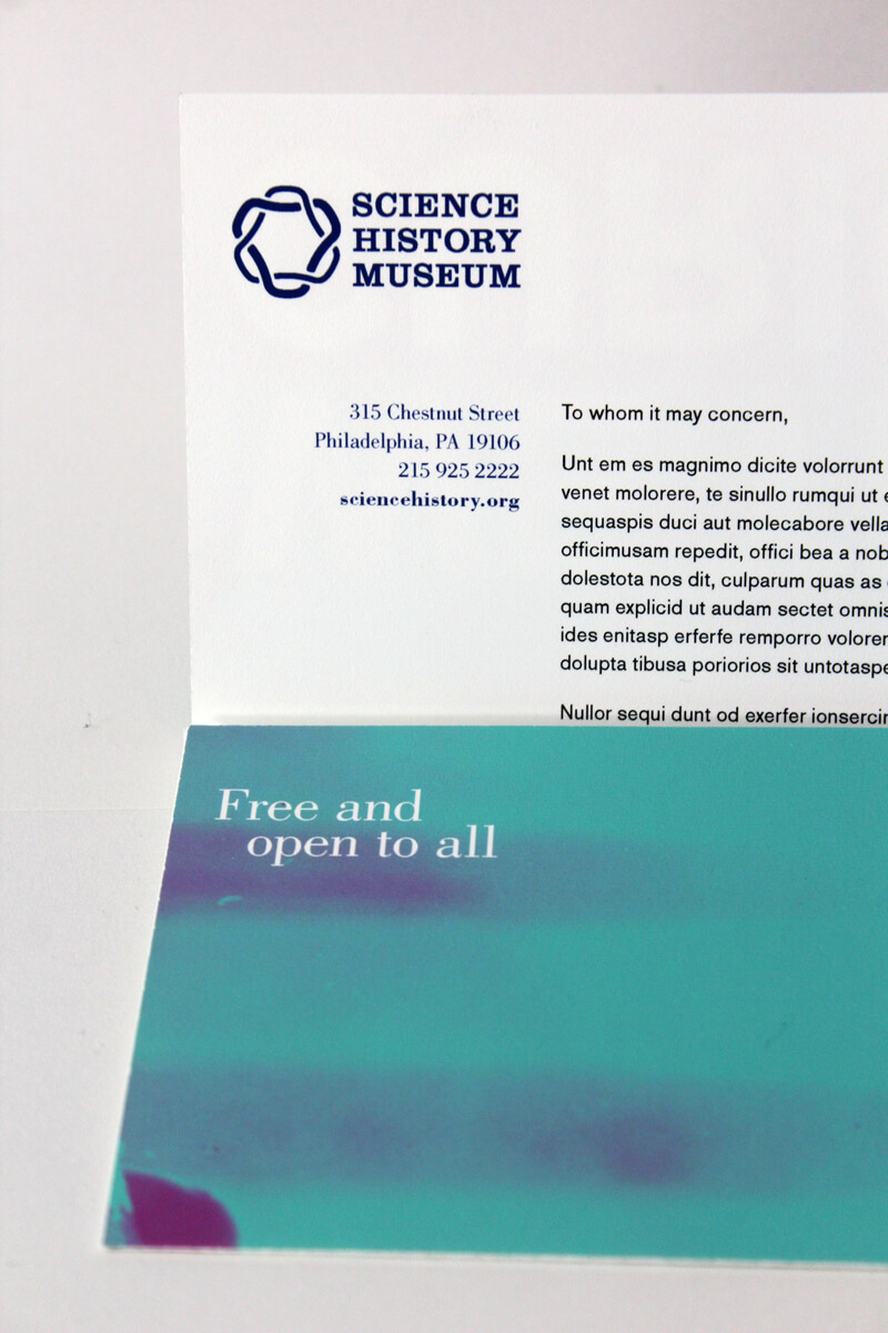
The developed logo was created from multiple scientific principles dictating how hexagons are one of the most
naturally optimized shapes. They’re seen within beehives, basalt columns, insect eyes, carbon rings, and
more! The typeface, Clarendon, was used to give the mark more gravity to show the museum is rooted in
history, as well as science.
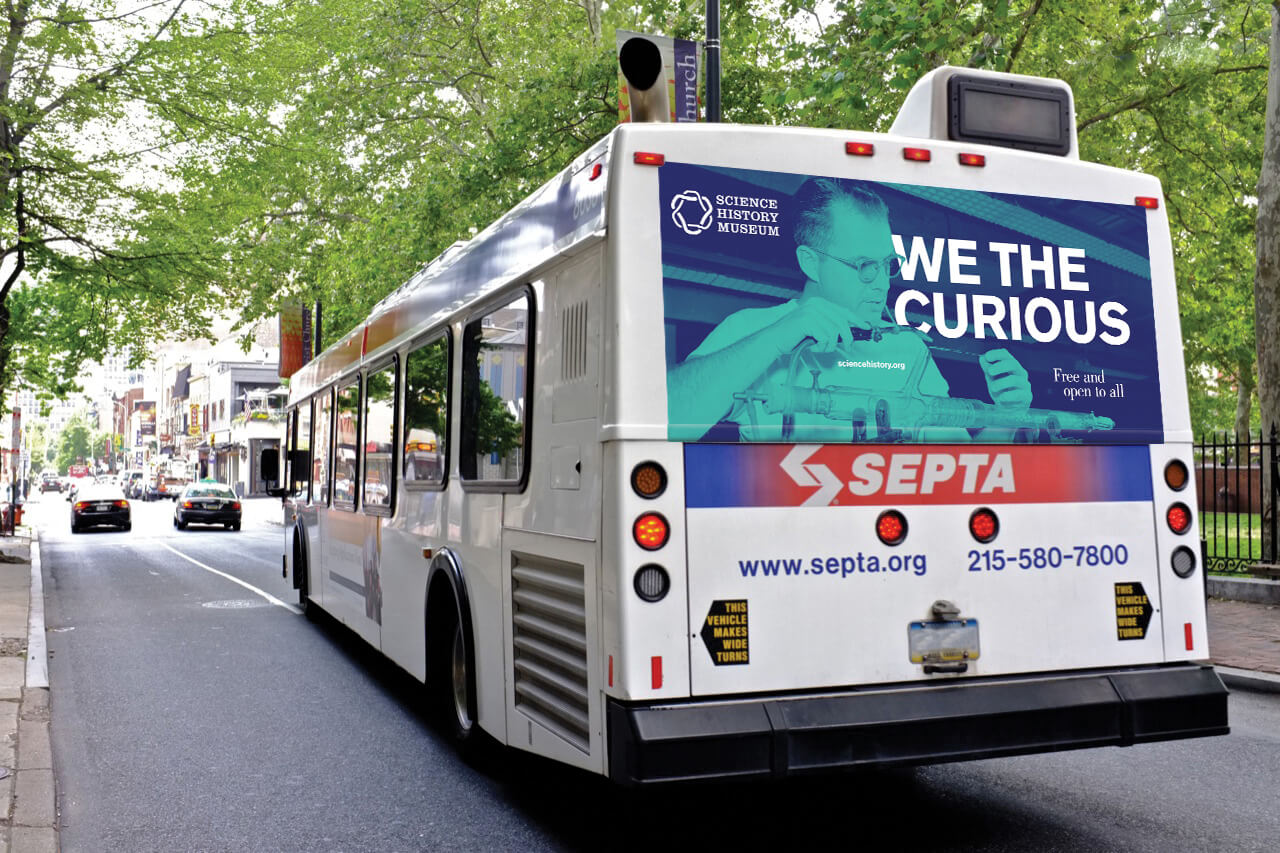
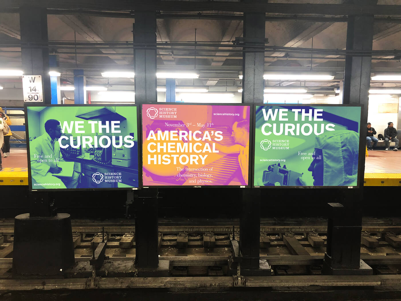
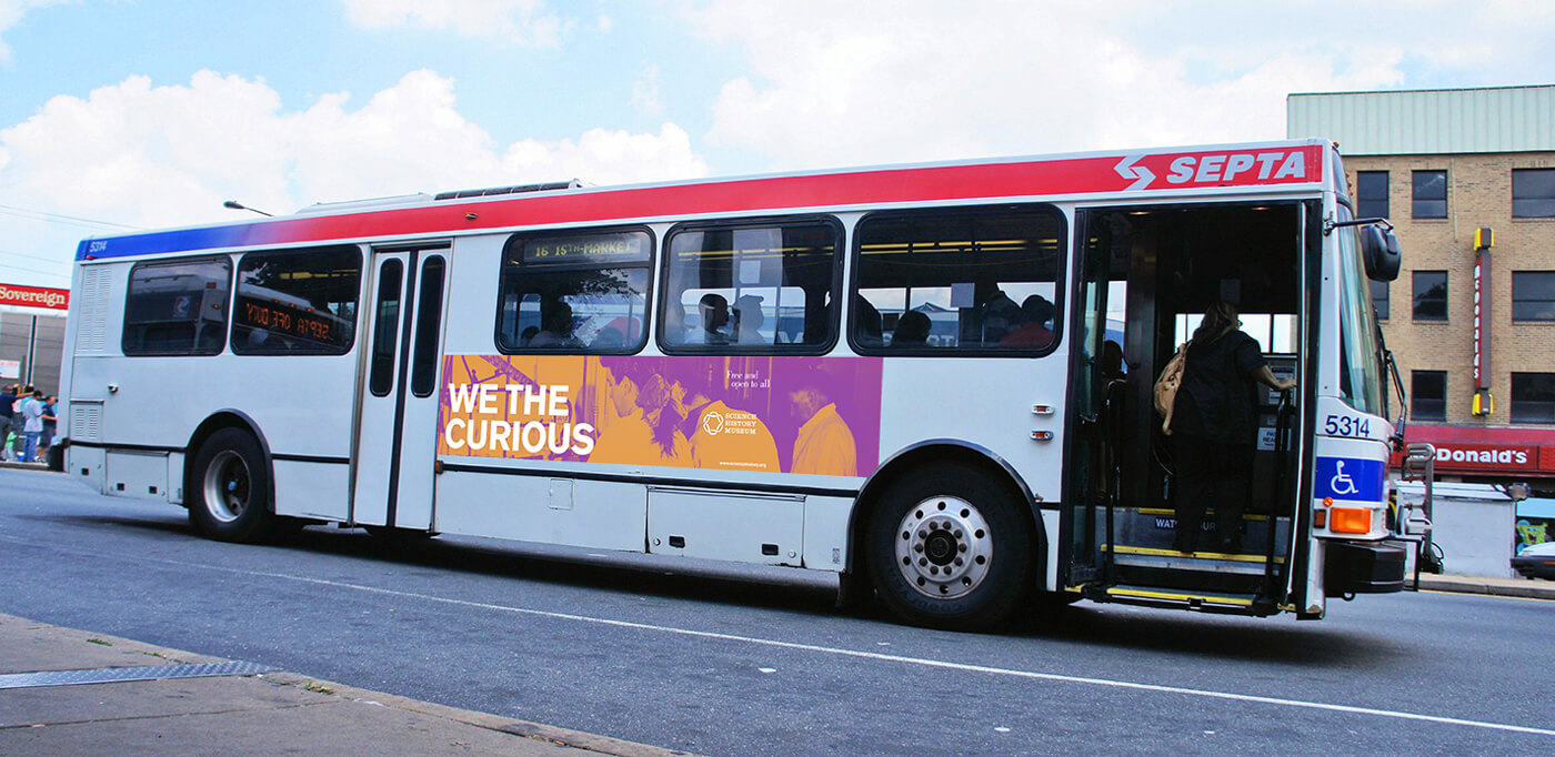
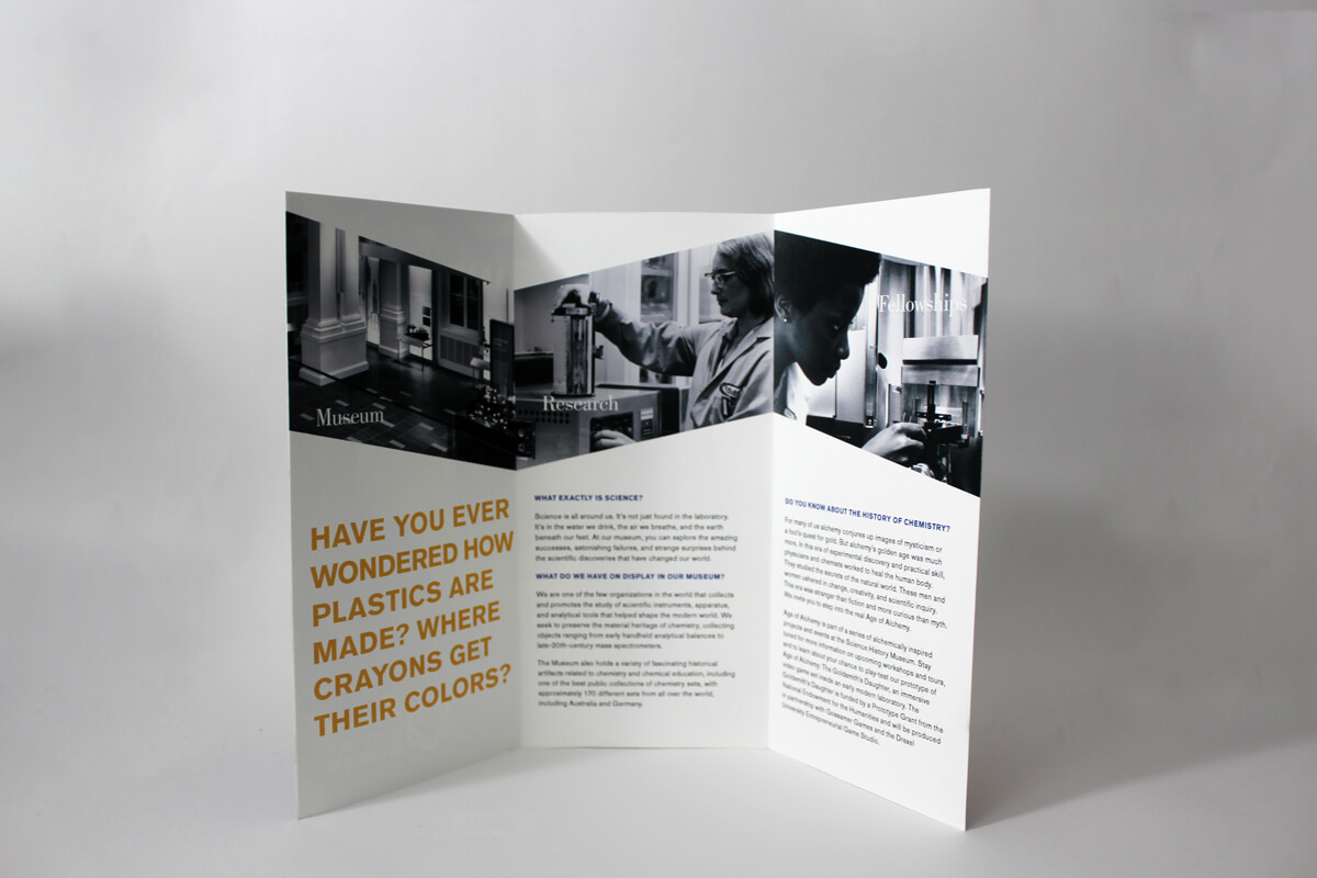
I rebranded Philadelphia’s Science History Institute into the Science History Museum. Since museum admission
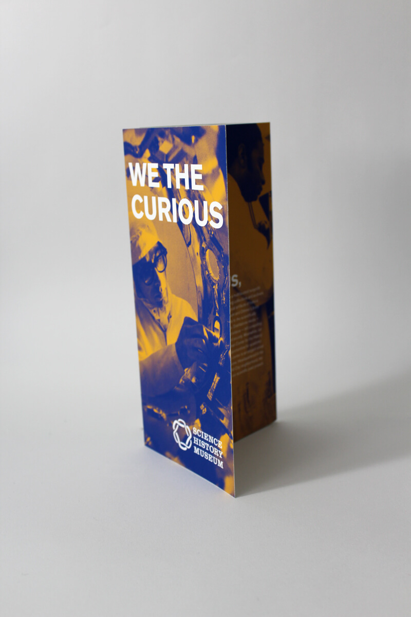
is free and open to the public, I decided the best way to reach a wide audience around Philadelphia was
through public transit. It's such a highly visible way to reach the masses throughout the city, and it felt like a perfect
match for the Museum.