Overview
R&D Dashboard is a collection of modules to help decisionmakers make informed choices about Pfizer’s business
directions. Since launch, the dashboard has resulted in a 25% increase in efficiency for R&D colleagues
Before engaging with the Customer Experience team, there were 15 different locations across the enterprise.
The team categorized the types of information into 4 different topics. Each focused on Financial aspects,
R&D aspects, Timelines aspects, and one general Overview across the board. I focused on the timelines
perspective and created an MVP experience to centralize 10 portfolios and 300+ internal and external
clinical data sources.
How might we consolidate finance and portfolio data across hundreds of data sources?
Scope and Constraints
As the team was working on all four modules concurrently, our communication needed to be consistent. We
agreed to meet at least once a week to discuss where we are in the modules and what components are being
used and/or created.
Process
UI Kit
As each team member took on all four different sections, I noted similarities across all of our files. With
my background in design systems, I created an affinity map of components and patterns. I worked with the
team to create reusable patterns that worked for everyone’s work as best as possible in parallel to
delivering product updates and launching new work flows. In total, the UI Kit includes 64 reusable
components and patterns to be leveraged across new modules, and 8 reusable standards for Data Visualization.
Wireframing & Prototyping
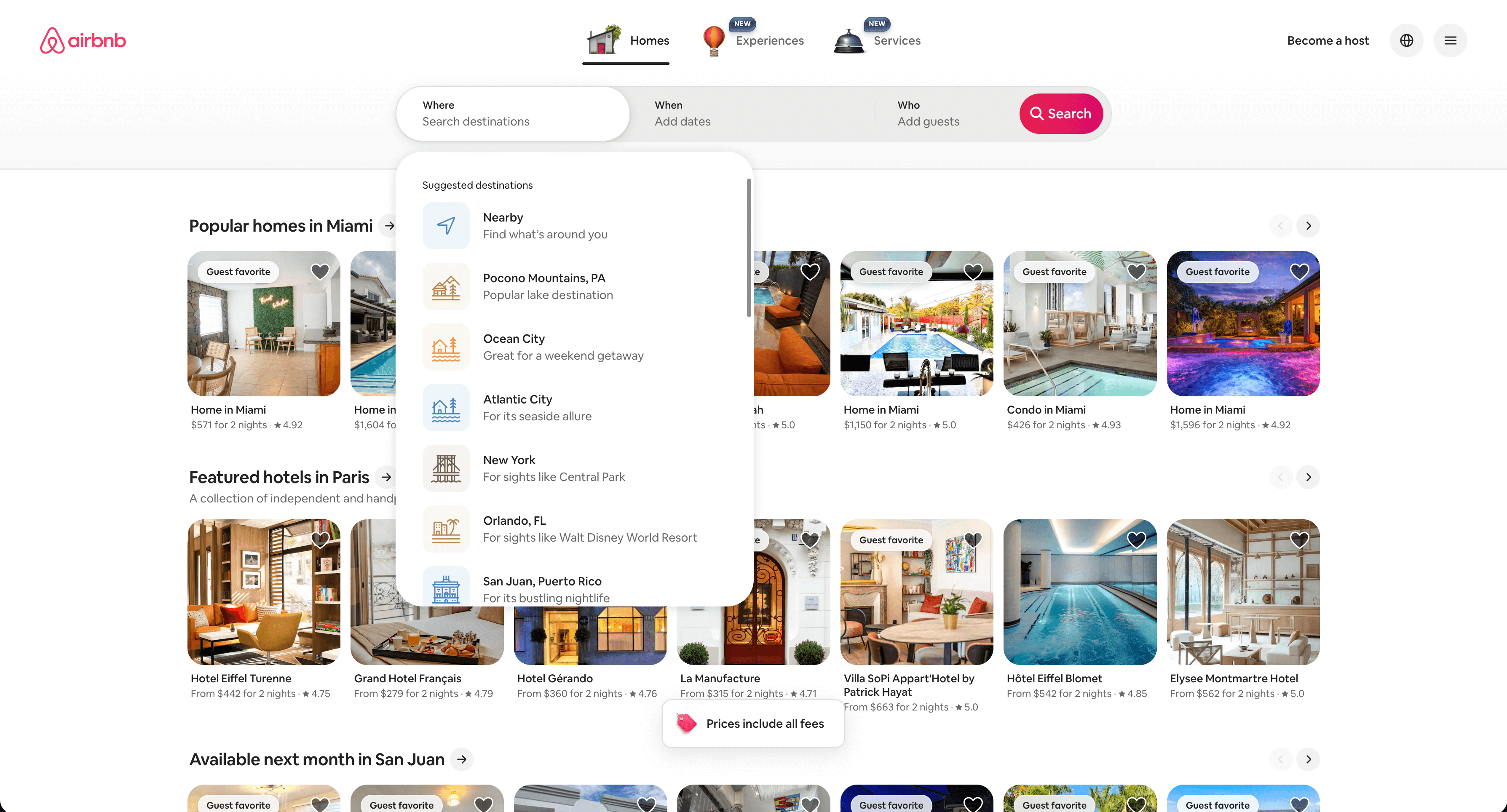
I looked at the tool that the decisionmakers use and took note of what insights they find most valuable. From
interviewing them, I learned that they want the most important data immediately accessible. Their existing
experience took 6 clicks to get from the home page to get to what they were looking for. I was inspired by
the search function from Airbnb's website. I liked how they treated their search like a funnel going from
the most general information to the most specific.
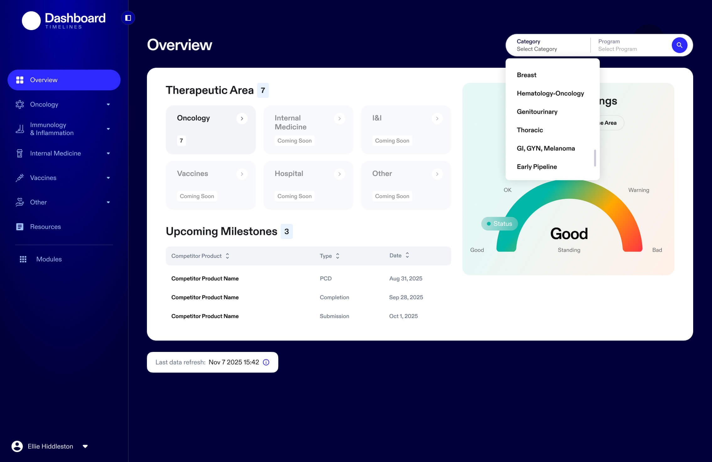
In working on the information architecture for the redesign, I was able to reduce clicks from the original 6
down to 4. I included two different methods of getting to the info. Option 1, the user could drill down from
page to page going from widest category to most specific subject to get to what they’re looking for. Option
2, the user could select from a dual dropdown. It does save the user time from loading those extra pages.
Outcomes and Lessons
After we handed off the Timeline module for development, I assisted with in-depth interviews with 6
colleagues across different roles. Users had expressed they wanted to be able to filter the data even
further. As the initial launch only covered one specific therapeutic area, I’d like to see how much more
this part of the R&D Dashboard can assist decisionmakers as more data gets aggregated from other therapeutic
areas.