Meraki Design System (Meraki) is a design system for internal websites, tools, and for external facing mobile
apps. In 2023, Pfizer initiated a rebrand for all print materials. My team, the Customer Experience Design
Team, was engaged to create a digital library as a companion to follow the new brand guidelines for all
digital products. Pfizer has over 74 markets under their umbrella, and this breadth became our guiding
light.
The Customer Experience Team already had Helix Design System, but sadly was retired due to a tech stack
migration. From my work in Meraki Design System, Pfizer had a total of $31m cumulative cost savings across
the work of 1,000 developers and designers both internal and external. I reduced time-to-market by nearly
50% and non-content related tasks by 35%.
I achieved these metrics using the formula: (designer + dev working hours) × (designer + dev
rate)
How might we upgrade the foundations of an existing Design System for all brands to be customizable and
repeatable?
While the design system's end users are the individual brands, the designers and developers who work to bring
the brands' visions to life are the main users. As the Lead Design System Designer, I am responsible for
developing and implementing the plan to create a Multi-Brand Design System. With an already established and
actively used design system, maintaining functionality of the system as it was still being used by multiple
teams was my main challenge. I used Figma as it is the tool of choice by internal teams and externally by
agencies.
Process
Tokens
The internal announcement of a rebrand at Pfizer came at the same time that Figma introduced Variables. I had
always wanted to expand my skillset with Variables and Mode swapping, and this was the perfect case for it!
Our first design system, Helix, had a similar paint-by-number token structure to Material
3 by Google.
Color Swapping
The color swapping was by far the most labor intensive part of the rebrand. Following rebrand completion,
Pfizer now had a new, expanded set of defined colors in 10 hues, and had begun encouraging all brands to
transition to those colors. I was anticipating a mass migration of color, which made an adaptive color token
structure especially paramount.
Based on internal research of the most popular and highest rated brands, most used a primary, secondary,
and tertiary color. I envisioned expanding upon this concept and making the brand selections easier for
designers and internal clients, so I created a proposal to have the primary, secondary, and tertiary
colors independent of one another. After creating a file to test the idea, I met with key members of the
larger Customer Experience team and Developer team. They agreed that the independent selection of the
different color categories is a viable, practical solution that expands the range of brand color
selection. The independent selections accomplishes the following:
Removes hierarchy to ensure equity and equal priority across brands.
Allows for over 1000 color combinations that designers can both play with and experiment with
highlighting one brand color over another. The potential color combinations then doubles to over
2000 when accounting for the addition of dark mode.
For example, if Brand X's primary, secondary, and tertiary colors are Red, Purple, and Yellow, the designer
can change the color order to best fit the project and change the whole site's personality with a mere two
clicks.
Typography
I used a similar approach from my work in color swapping and tokens for my typography proposal. Pfizer's
rebrand had included 5 proprietary font families. I created tokens of the font families and attached those
to the headings (h1-h6) to allow designers to swap families per heading level as needed. Allowing family
interchangeability gives designers more freedom in expression of each project.
Note: For demonstration purposes, I have changed the Design System's typefaces.
Layout & Spacing
With newfound freedom for designers in finding the most appropriate design language of a project, there still
needed to be a unifying force that underpins structure across all projects as it all falls under the Pfizer
umbrella. In looking at the hierarchical grid examples within the book “Making and Breaking the Grid” by
Tymothy Samara, as shown on pages 78 and 79 for IAS Magazine mastheads, I realized the similarities
in
vision between my work and Samara’s findings: Differing colors and typography, but preserve the structural
elements across each project.
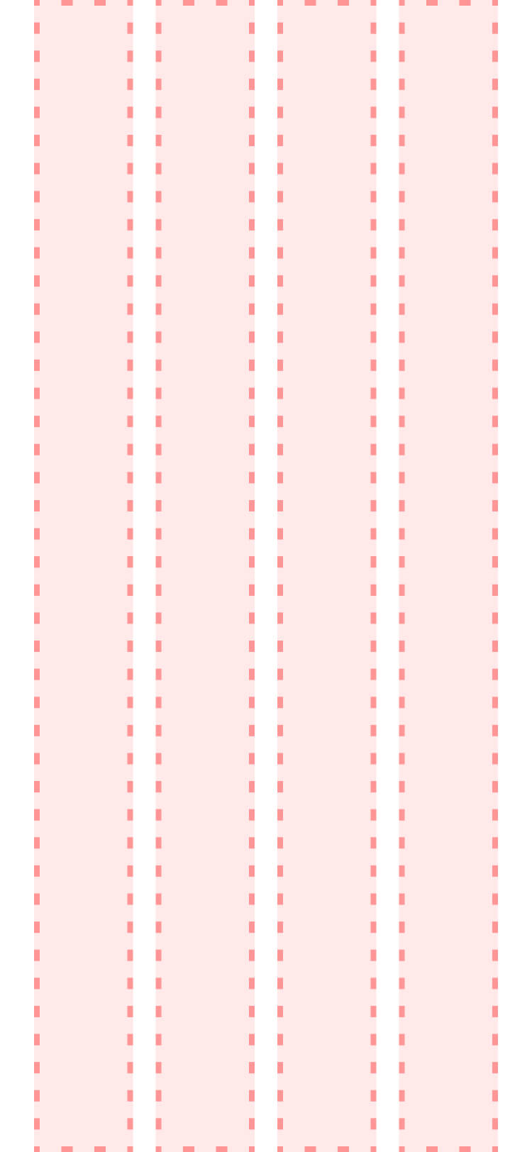
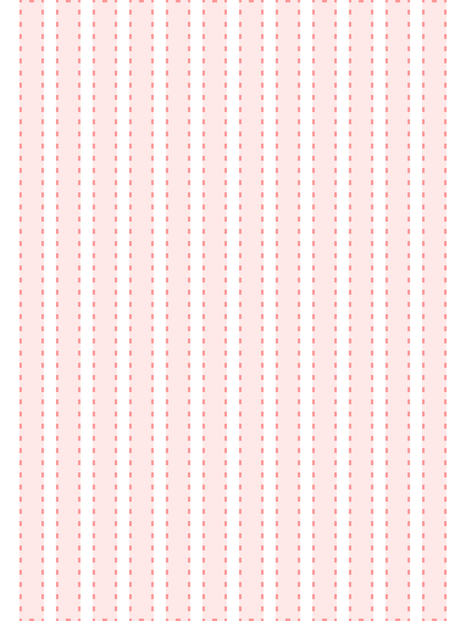
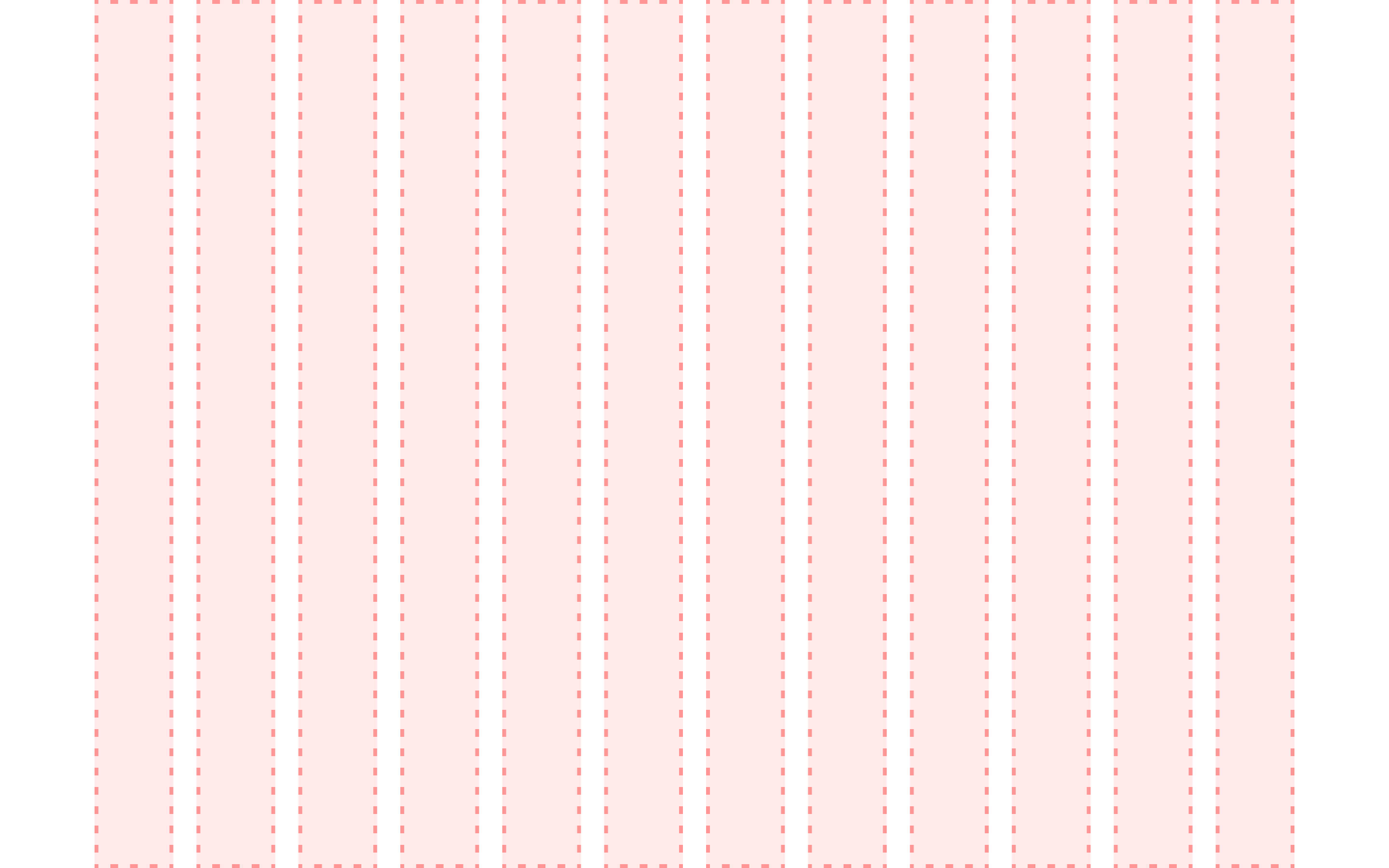
Mobile Grid
Tablet Grid
Desktop Grid
I wanted to standardize the breakpoints, components, and patterns' respective grids, padding, and horizontal
and vertical spacing. To achieve these goals, I created different Modes for breakpoints across all screen
sizes (i.e., small, medium, large, and extra large). From a broadened perspective, the Variable
Collection
also includes font size for all forms of text, from headlines to labels to buttons and more. Encompassing
all sizes within the scale of all Collections is necessary for all screens that designers are going to be
working within.
Border Radius
To add additional dimension to Meraki, the team felt it necessary to investigate potential use-cases in
border radii. The team knew early on in the implementation that both a static collection that cannot change
and a dynamic collection of radii options that can change in prototypes if necessary was needed.
Training and Development
After meeting with key members while working on color and subsequently fleshing out the foundations and
tokens, I wanted to ensure that the larger CX Team was fully up to speed on the progress made up to that
point. I led a series of team huddles to go over different aspects of each category. It was extremely
important to me to make it clear to the team that, while this part of the project was considered "done," the
work was not over. I wanted to treat the huddle series as a client review, and wanted to hear any and all
feedback or critiques the designers on my team may have had.
In working with our developers, we looked into using Figma's REST API. I coordinated a call between our
development team and a Developer Advocate at Figma, ensuring our developers were best set up for the
introduction of variables and how they work in Figma. I learned some JSON to understand how to best
categorize variables into separate sections and categories, as well as streamline communication between the
design team and development team.
Outcomes and Lessons
Since creating new features, my team saved 53,000 work hours and over 398,000 component inserts. Now,
covering additional product areas across Pfizer while fitting end-user expectations of a modern design
system is the next phase I am focusing on.
Internally, I was a founding member of the Zenith Team, a spin-off design kit for marketing websites. Based
on my findings from my work on Meraki, I helped shape its foundations.
Future Features
Using this file and new set of foundations, we have been able to expand the breadth of what our team can
offer. Along with the core Design System file, I have spearheaded the initiative to include a Patterns &
Templates kit, AI kit, Data Visualization kit, Dashboard kit, along with a mobile app kit on the way.
With Figma offering new tools and features every year, I am especially excited to see what Extended
Collections will look like when applied to a design system. I have been looking forward to something like
this in Figma for a while, especially since we cannot add formulas to variables just yet. Yet. 😉