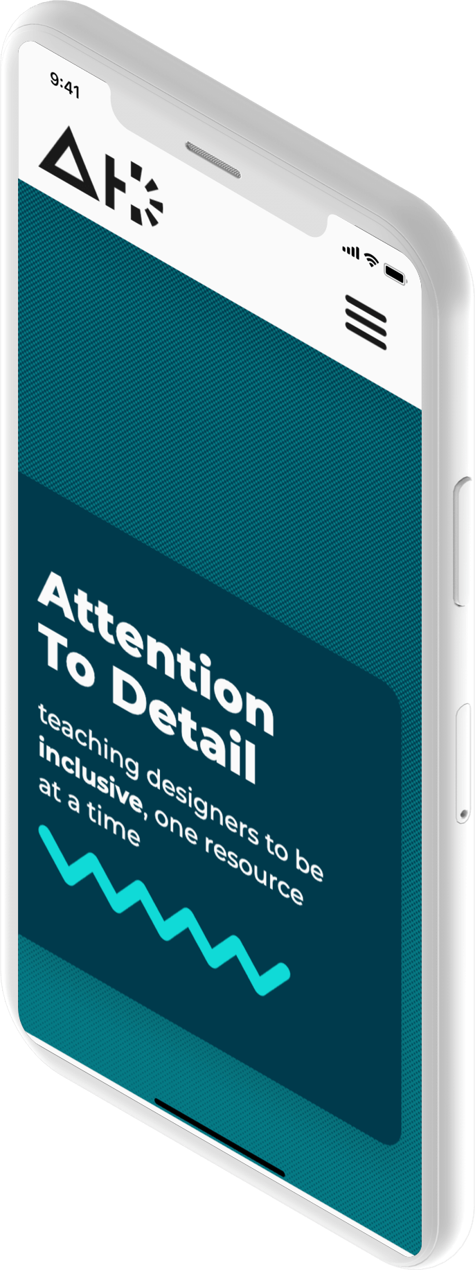
Attention to Detail was conceptualized from a lack of resources on accessibility within design easily available
to designers. Accessibility, especially in design, is only ever taught for those pursuing master’s degrees, or
on the job
in one’s relevant field, if that. Attention to Detail is only part of an answer to that problem. It’s a resource
of resources for all designers of every field.
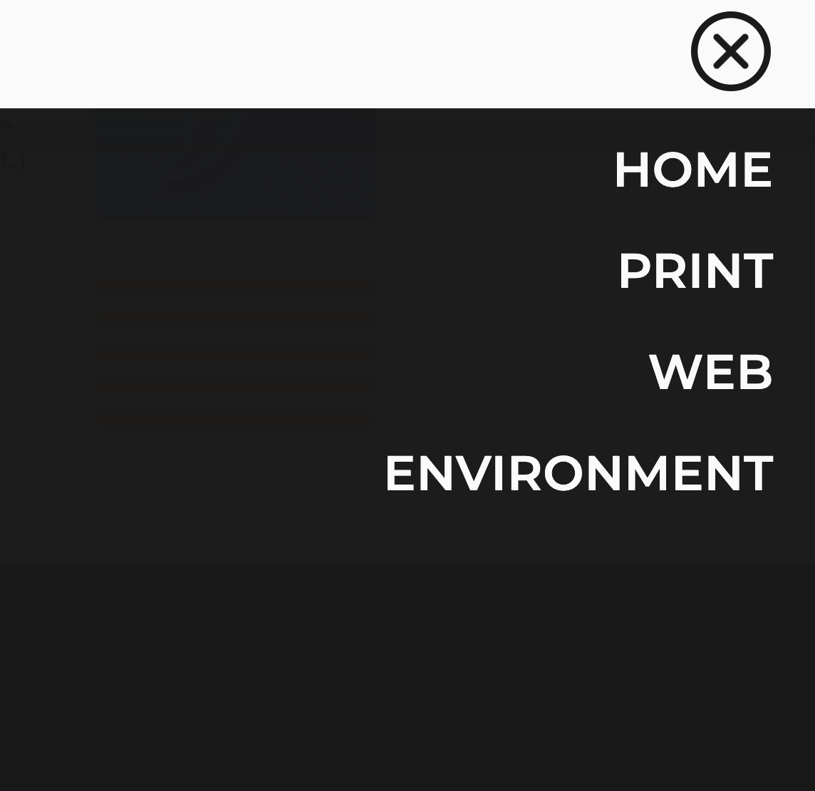
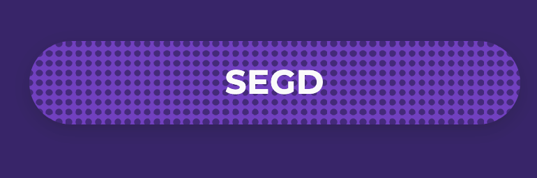
Color
The brand colors are fluid from one page to the next to indicate the different fields of design. The
white
and black have a touch of grey in each so that the contrast isn’t too harsh with overlaid text. The
off-white color is to denote different sections, and to subdue iconography. The primary dark blue
was used because the concept of accessibility is traditionally a bright blue. This created a vacuum for
a
bright accent color. In order to give AtD an
educational feel, I wanted to stick mainly to the primary colors, because of that I chose a vivid
yellow.
Iconography
Due to the audience being primarily designers, I had leeway with the iconographic language. I utilized the
universal abstract language of basic shapes that designers of different fields use almost daily. All
different shapes have the
same line width with a rounded endcap. Everything is set on a 40pt grid.
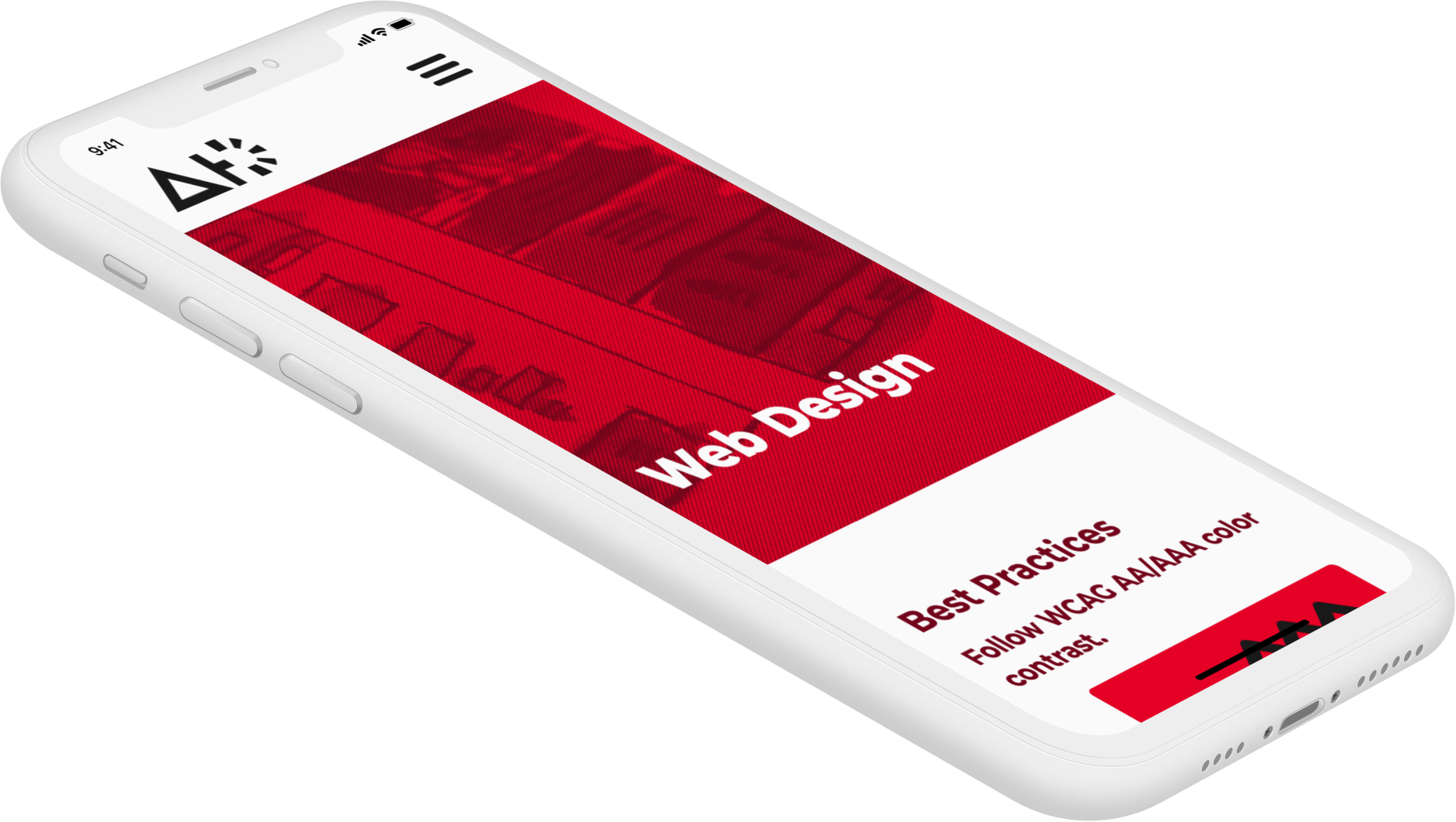
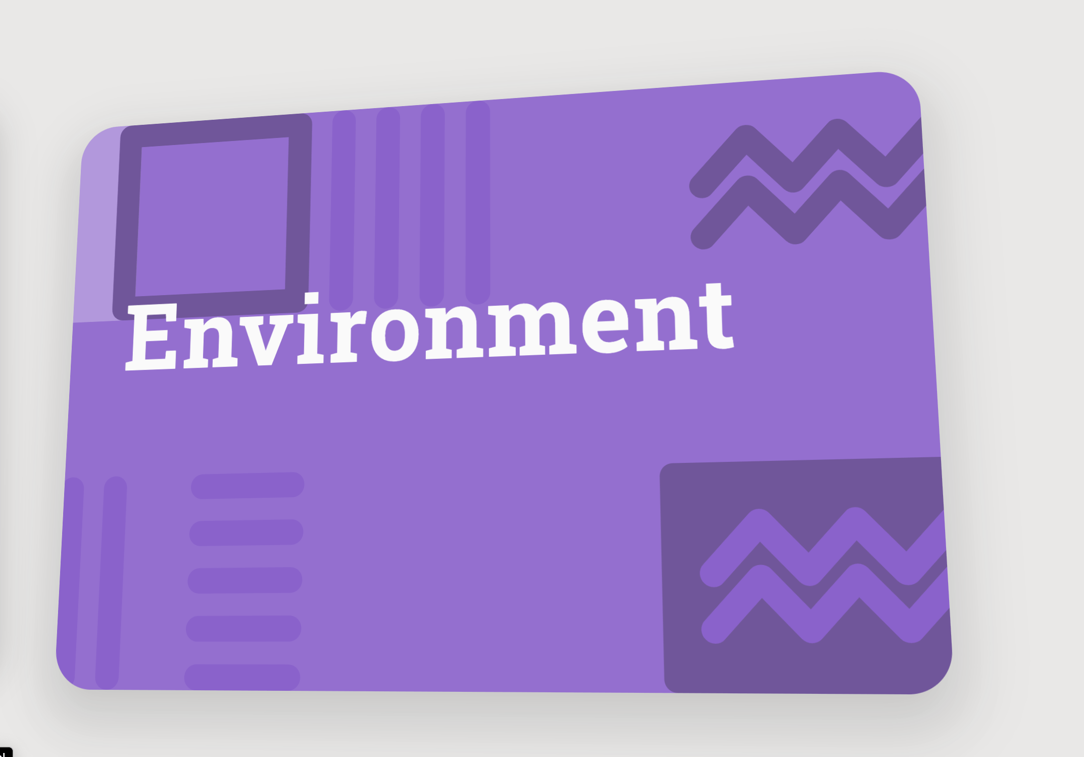
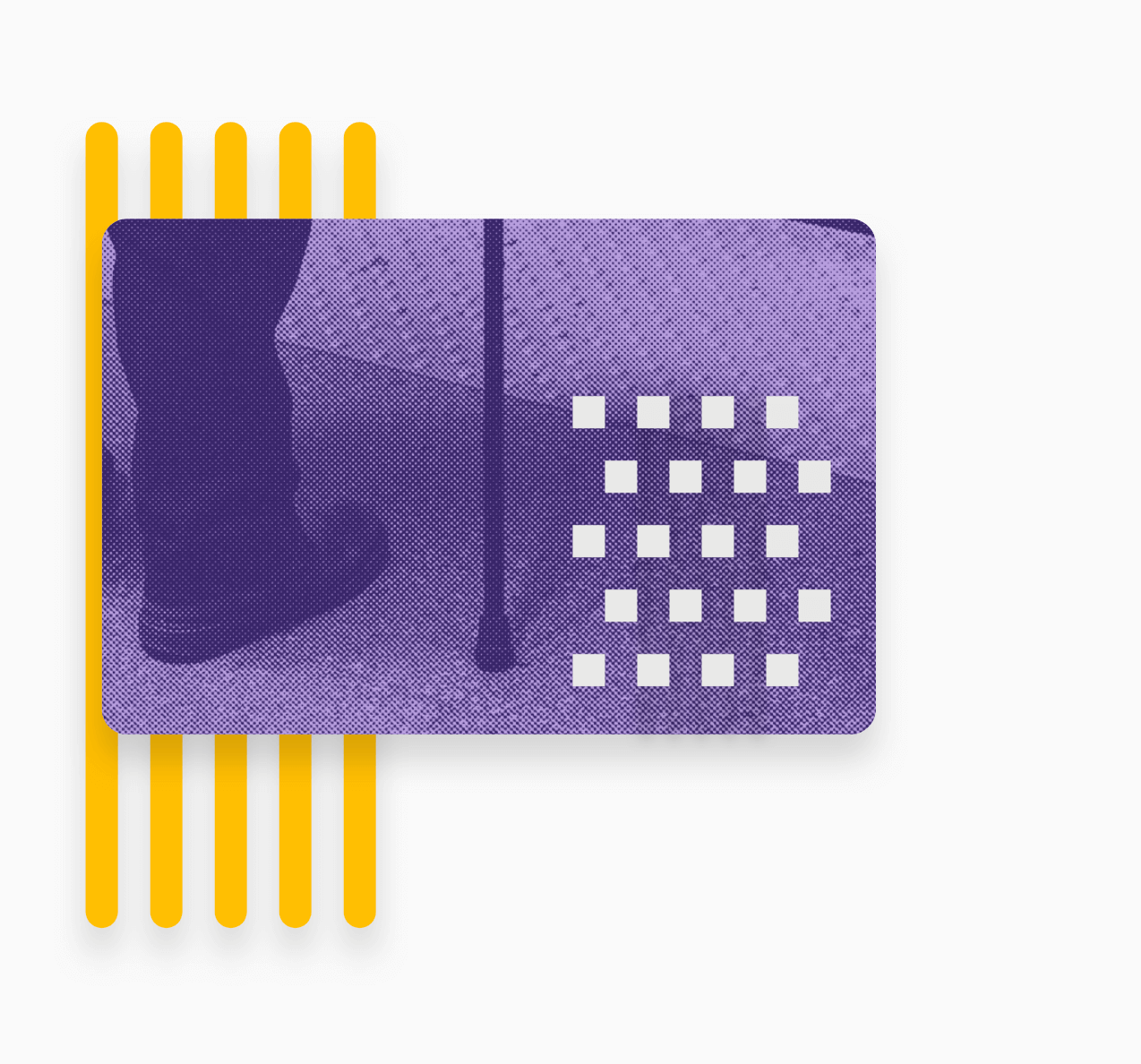
Each field of design has their own specific treatment as well. Print design primarily uses circles and
halftone patters due to the way ink is printed. Web design has triangles because it is the only sharp shape
in the library, and due
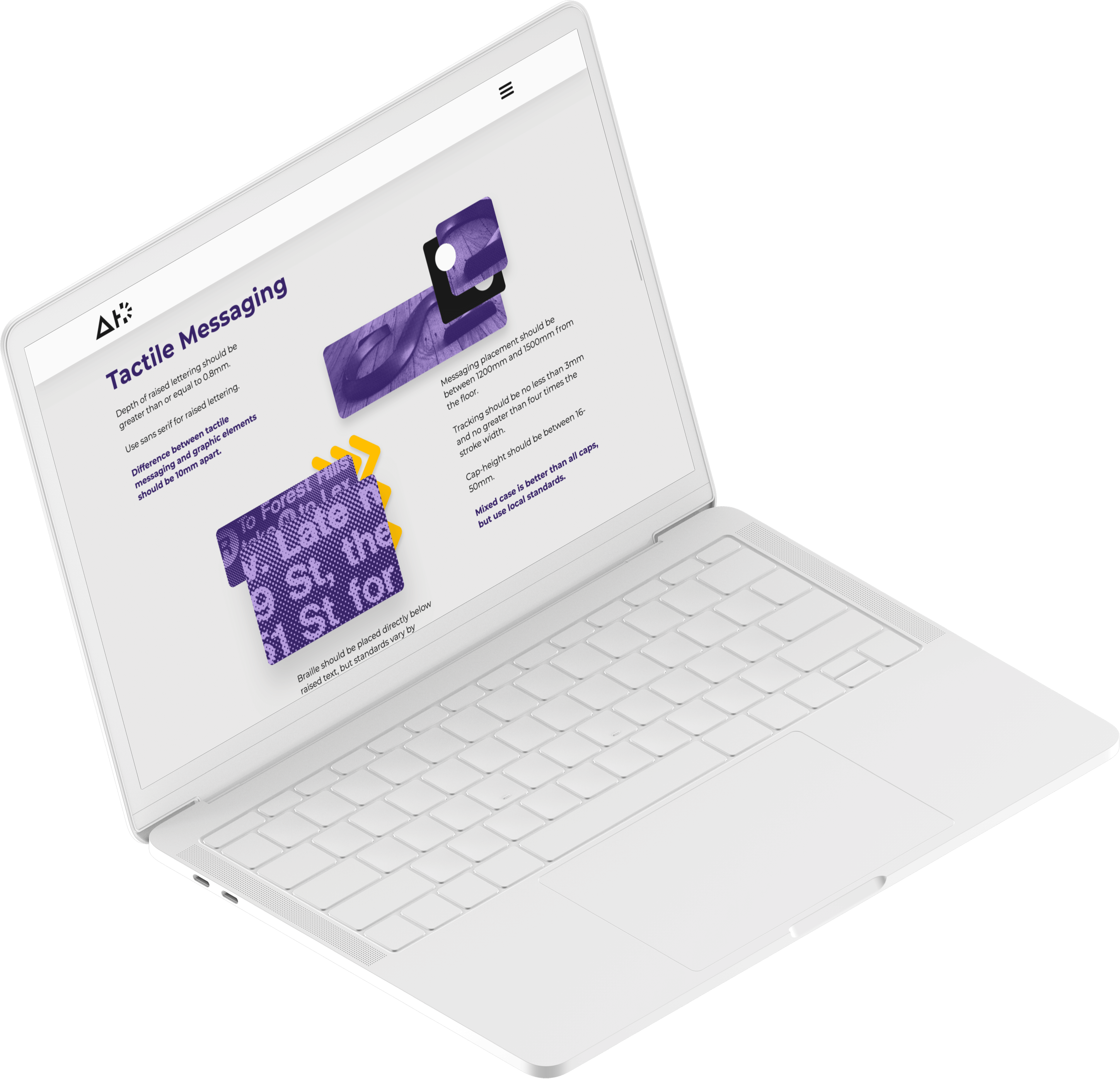
to the nature of how screens process SVGs. Environment design’s treatment is unique in that it is primarily
free-form and overlapping, but with the addition of shading to show depth and volume within the iconography.
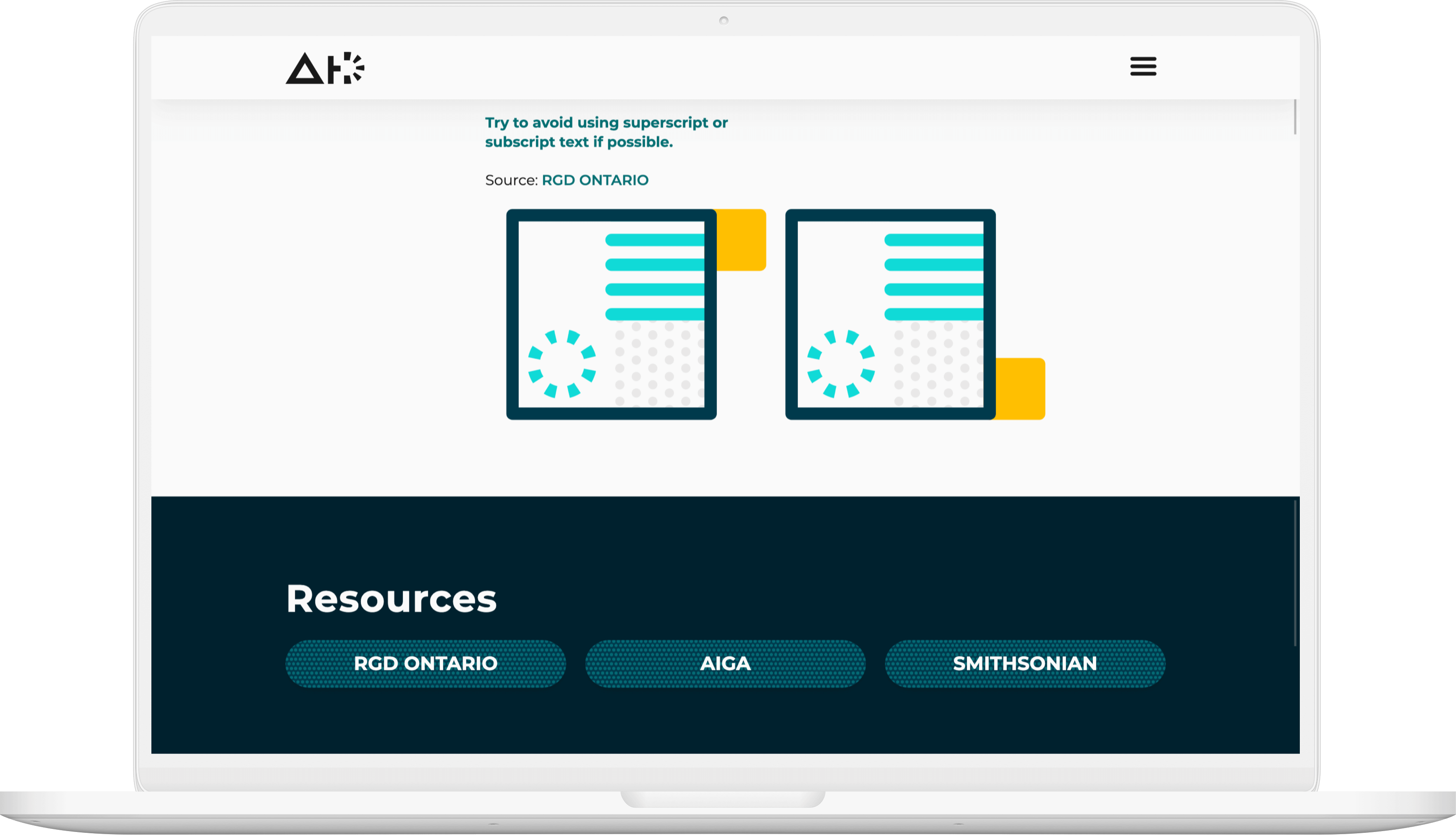
Imagery
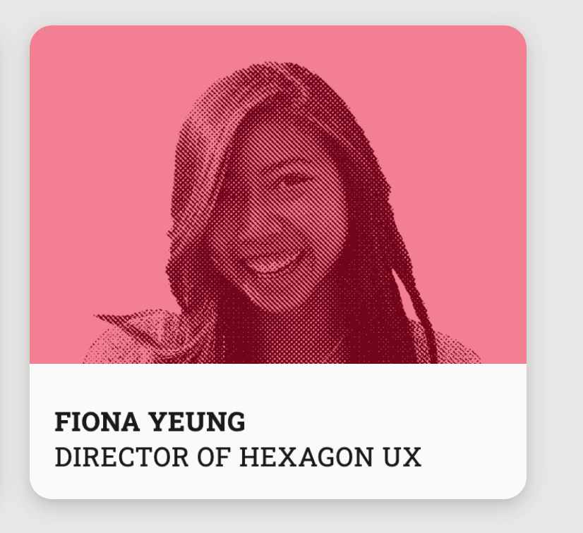
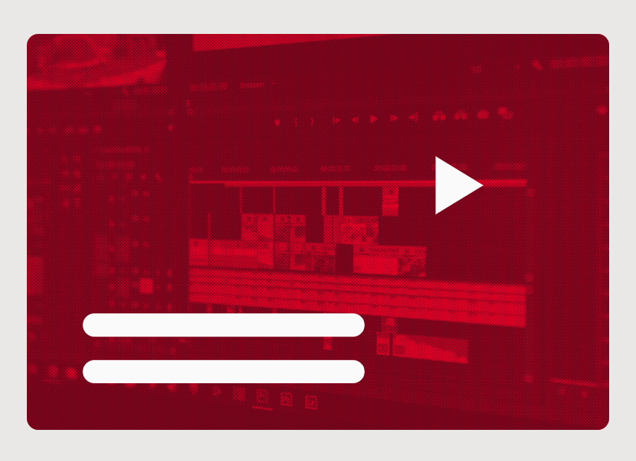
When the colors are applied to the iconography, the imagery is fully realized, and the language is fleshed
out. On top of the icons, the images are treated with a halftone pattern to better emphasize the basic
shapes and the root of design. Included in this imagery style are buttons, cards, and supporting imagery.
They link out to different companies and prominent
figures in their respective fields who are vocal about accessibility in design.